PRODUCT DESIGN
bee social-able
CLIENT
Hive - Bee Social-able
DATE
2023
ROLE
UI/UX Designer
Moving to a new city makes it difficult to build friendships, often due to social anxiety and fear of rejection. This challenge inspired the creation of a product designed to help people connect more easily.
TOOLS

PROBLEM STATEMENT
Users relocating to a new city struggle to build friendships due to social anxiety, limited opportunities, and fear of rejection.
SOLUTION
Bee Social-able provides a safe, low-pressure way to build connections through guided conversations, local events, and flexible ways to engage at your own pace.
DEFINE
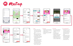
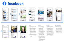
COMPETITIVE ANALYSIS
We found that users value event recommendations, friend suggestions, and easy access to group activities.
INSIGHTS
-
Recommendations and notifications increase engagement
-
Simple navigation improves usability
-
Complex mobile layouts can feel overwhelming
TARGET AUDIENCE
-
Ages 32–55
-
Equal mix of men and women
-
Use both mobile and desktop
-
Middle-class professionals
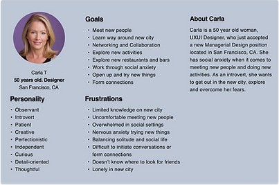
PERSONAS
Personas highlighted the need for a supportive, low-pressure experience. Features like guided prompts, local recommendations, and solo-friendly activities help users connect at their own pace.
EMPATHY MAP
Users feel overwhelmed and anxious when trying to build new connections. Clear guidance, community features, and low-pressure interactions help reduce anxiety and build confidence.
KEY DESIGN DECISIONS
-
Designed low-pressure interactions to reduce social anxiety
-
Used guided prompts to support conversations
-
Prioritized local events to encourage real-world connections
-
Simplified navigation for quick discovery


IDEATION
SITE MAP
The site map outlines a clear, user-friendly structure with key features like Explore, Favorites, and Tickets.
Streamlined navigation supports tasks such as discovering events, purchasing tickets, and managing profiles, creating a simple and engaging user journey.

USER FLOW
The user flow focuses on clear, goal-driven paths for finding friends and purchasing tickets.
Each flow is streamlined to minimize steps and reduce cognitive load, helping users complete tasks quickly and confidently.

DESIGN
LOW FIDELITY WIREFRAMES
Low-fidelity wireframes helped test and refine the app’s functionality, navigation, and layout. Early feedback validated core features and guided content placement.
This process ensured the structure aligned with user needs, creating a strong foundation for the final design.
DESIGN SYSTEM
The design system creates a cohesive and engaging visual experience. A unified dark theme with blue and purple accents supports consistency, while the Inter typeface improves readability and accessibility.
Consistent use of color, typography, and components simplifies the interface and ensures a polished, user-friendly experience.


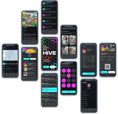
HIGH FIDELITY WIREFRAMES
High-fidelity wireframes provided a clear view of the final design, helping align stakeholders and developers early in the process.
They supported feedback, identified design issues, and refined details, improving collaboration and reducing rework.
TESTING


FINDINGS
User testing revealed opportunities to improve clarity and navigation. Updates included adding a “search new friends” button, highlighting shared interests, prioritizing new messages, and increasing the visibility of the back button.
These changes improve usability, navigation, and overall experience.


RESULTS
User testing showed strong positive feedback, with users praising the app’s intuitive navigation and overall design.
Participants expressed interest in using the app, confirming that the experience felt accessible, engaging, and aligned with user needs.
REFLECTIONS
This project reinforced the value of starting with strong user research and iterating based on feedback.
Focusing on personas, usability testing, and continuous refinement helped create an experience that is both intuitive and engaging.